Back to: Introduction to R
Axes and Legends
We can modify both axes and legends. ggplot2 actually considers these objects to be the same type of object. This means if we learn the tools to work with a legend then we can change the Axes in the same way and vice-verse.
| Axis | Legend | Argument Name |
|---|---|---|
| Label | Title | name |
| Ticks, grid line | Key | breaks |
| tick Label | Key Label | labels |
Scales
Scales are required and included in every plot. If we do not specify them, ggplot2 includes them in the background. For example:
geom(data, aes(dep_delay, arr_delay)) +
    geom_point(aes(color="carrier"))
is read in by ggplot2 as :
geom(data, aes(dep_delay, arr_delay))+
    geom_point(aes(color="carrier")) +
    scale_x_continuous() +
    scale_y_continuous() +
    scale_color_discrete()
Many times we do not need to adjust the scale. This is why they will automatically be included. However if you want to override them, simply fill a scale in the previous scale functions.
Scale Title
The first argument in a scale function is the axes/legend title. We can use 2 types of text:
Strings
Mathematical Expressions
For example we will create 2 plots below. They will be the same plot but we will allow the first one to just be a string and the second to be a mathematical expression.
df <- data.frame(x = 1:2, y = 1, z = "a")
    p <- ggplot(df, aes(x, y)) + geom_point()
    p1 = p + scale_x_continuous("X axis")
    p2 = p + scale_x_continuous(quote(a + mathematical ^ expression))
grid.arrange(p1,p2, ncol=2)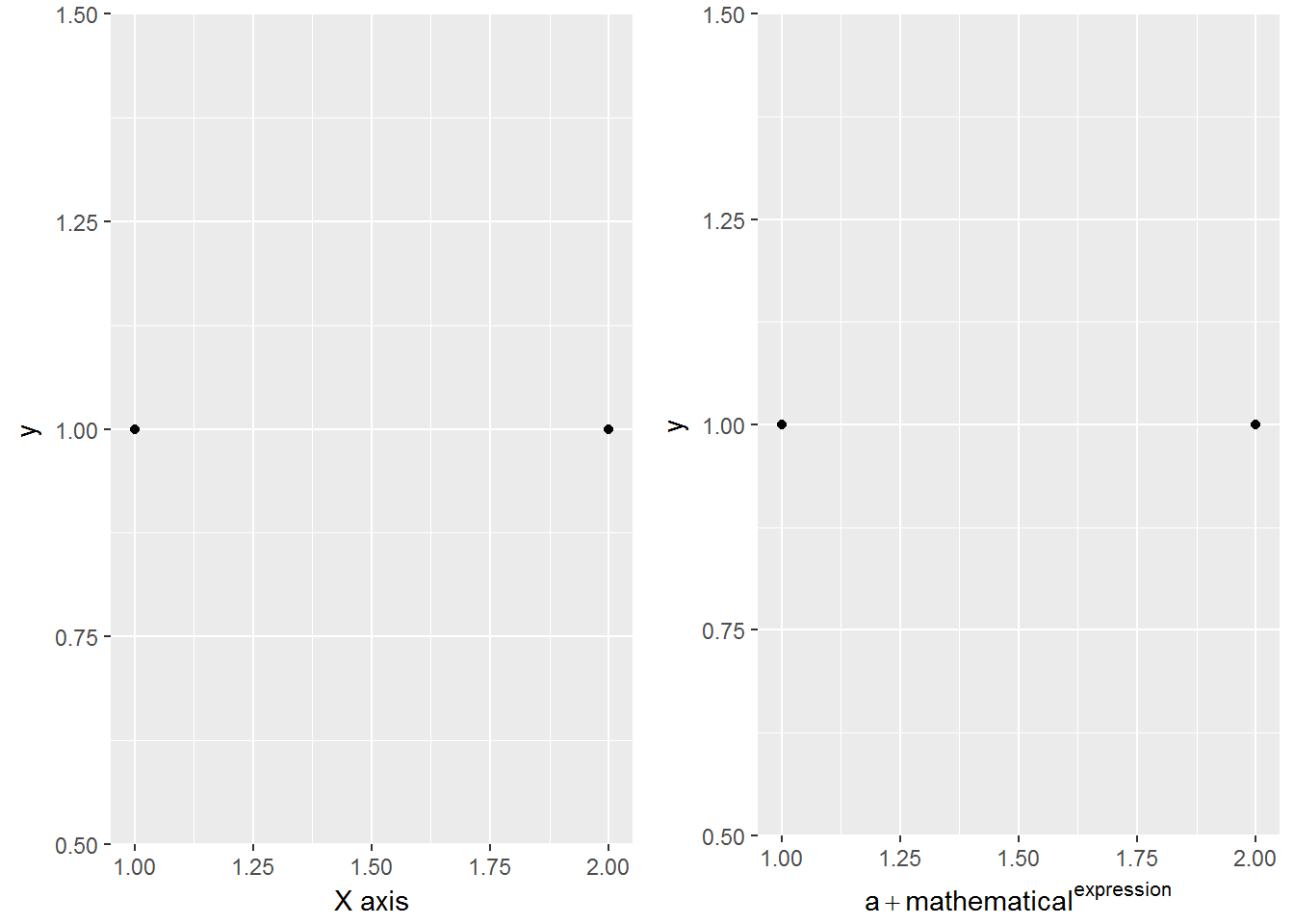
Labeling a Scale
Earlier we learned about common labeling functions such as:
xlab
ylab
labs
We can also use common text notations in order to add further details:
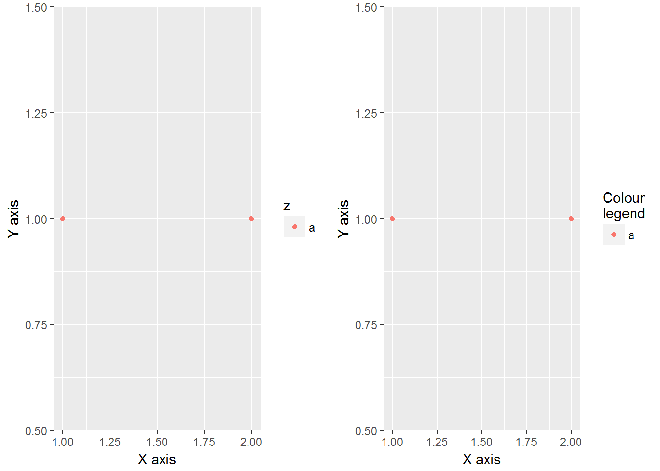
p <- ggplot(df, aes(x, y)) + geom_point(aes(colour = z))
    p1 = p + xlab("X axis") + ylab("Y axis")
    p2 = p + labs(x = "X axis", y = "Y axis",
                  colour = "Colour\nlegend")
grid.arrange(p1,p2, ncol=2)
The code above contains "Colour\nlegend", \n is a shortcode for letting R know that you wish to have a new line. The output of this is shown below.
Breaks and Labels
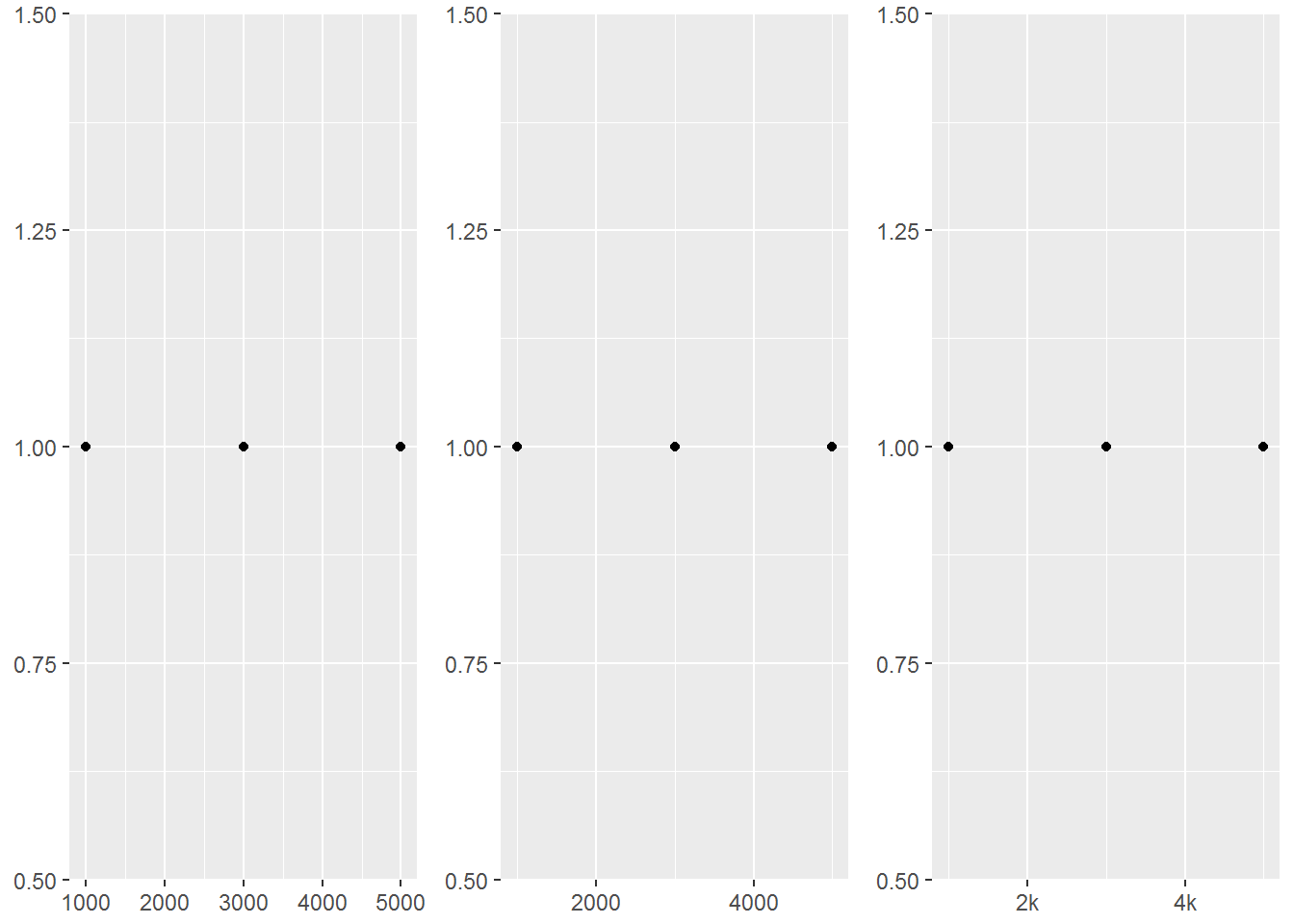
We not only like to be able to change the labels of scales but it can be helpful to choose the tick marks as well. The breaks argument controls what values appear as the tick marks on axes and keys.
df <- data.frame(x = c(1, 3, 5) * 1000, y = 1)
axs <- ggplot(df, aes(x, y)) +
geom_point() +
labs(x = NULL, y = NULL)
axs
axs + scale_x_continuous(breaks = c(2000, 4000))
axs + scale_x_continuous(breaks = c(2000, 4000), labels = c("2k", "4k"))
We can see that the above code creates a scatterplot called axs where originally the x and y axes are not labeled and R chooses the tick marks. Then in the second plot we force the tick marks to show at 2000 and 4000. Finally the third plot changes the text at these tick marks.
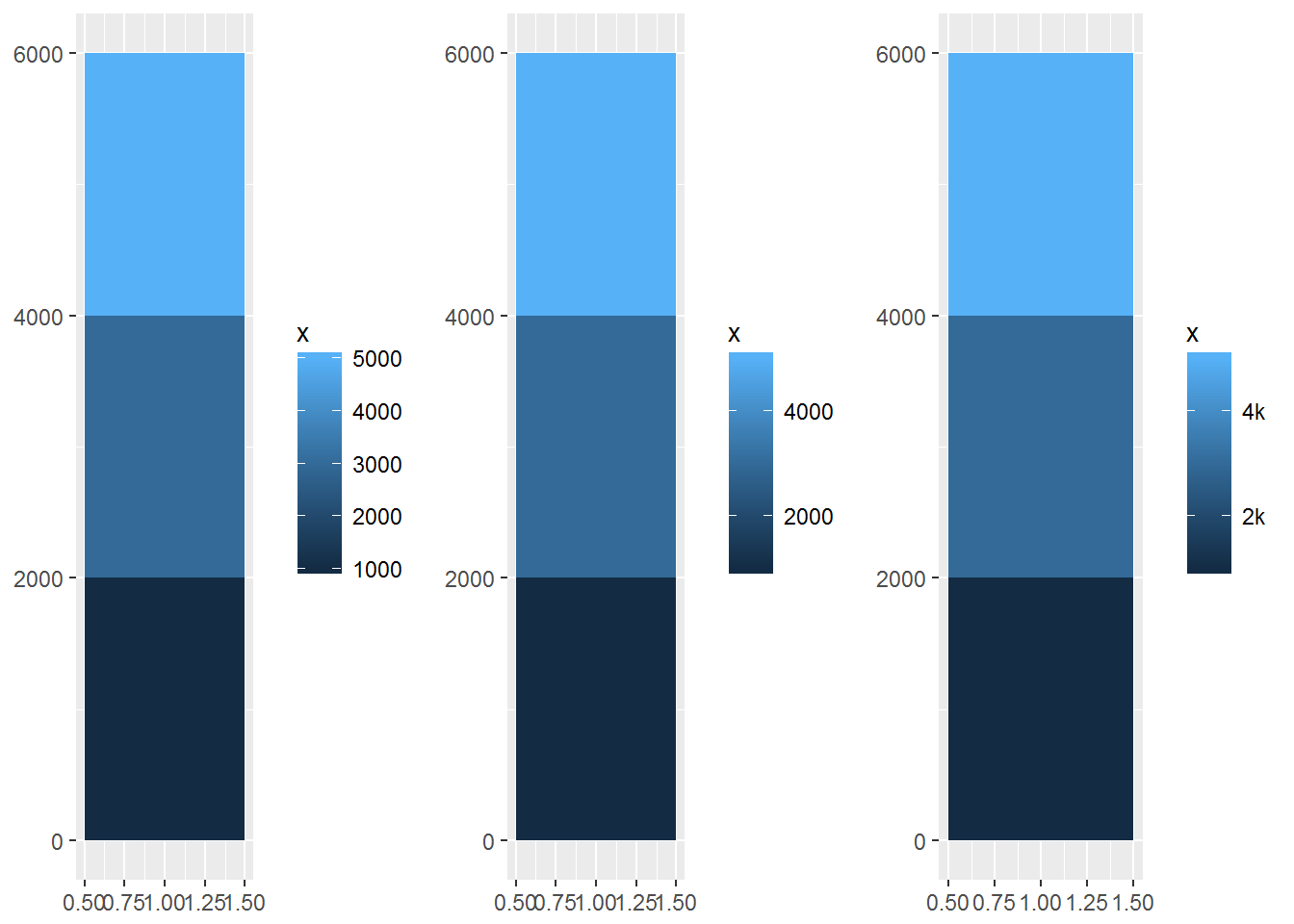
As it was state before ggplot2 considers axes and legends to be the same type. This means if we are creating a continuous scale with a bar graph coloring or even a heat map we can change the tick marks on the legend as well.
leg <- ggplot(df, aes(y, x, fill = x)) +
    geom_tile() +
    labs(x = NULL, y = NULL)
leg
leg + scale_fill_continuous(breaks = c(2000, 4000))
leg + scale_fill_continuous(breaks = c(2000, 4000), labels = c("2k", "4k"))
We see that just like the axes above we now have three different legends with the tick marks and labels of them changed.
We can also force different axes to be on a discrete scale rather than continuous.
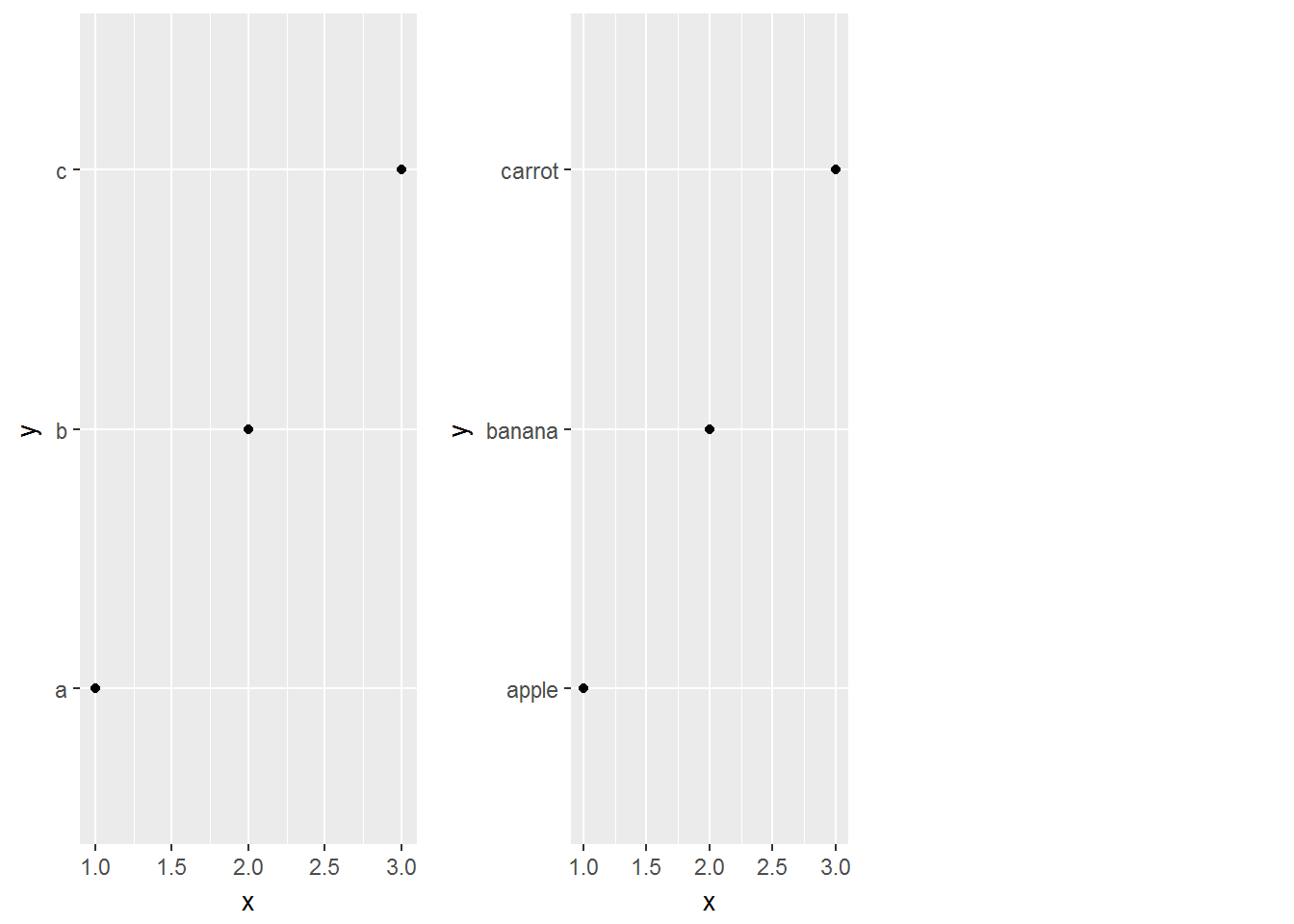
df2 <- data.frame(x = 1:3, y = c("a", "b", "c"))
ggplot(df2, aes(x, y)) +
    geom_point()
ggplot(df2, aes(x, y)) +
    geom_point() +
    scale_y_discrete(labels = c(a = "apple",
                                b = "banana", c = "carrot"))
We now change just the tick marks and scale of the y-axis. We can even set the tick marks to be different words.
There are some more breaks we can do as well as labeling techniques. Reading the ggplot book would be worthwhile for more complex graphs.