Back to: Introduction to R
So far with ggplot2 we have seen a lot of the different tools and capabilities that is has. We have not however discussed how we proceed to build a good graphic. This example comes from Hadley Wickham
We will begin by looking at what every graph needs:
Data
Aesthetics
Then we will look at other features that we may want to add:
Stat transforms
Position Adjustments
Data
All graphs need data in the form of a data frame. Many times ggplot will perform behind the scenes operations on the data and create a new set in the background.
Aesthetic Mappings
Aesthetic mappings are defined by aes(). These describe how variables are mapped to visual properties. In short we can map data to x and y values, color, sizes and shapes. We can call aesthetics in the initial call or in multiple layers.
Examples of Aesthetics
We will use the code below to look at the various ways in which we can add aesthetics into graphs:
library(gridExtra)
ggplot(data, aes(dep_delay, arr_delay, colour = carrier)) +
    geom_point()
ggplot(data, aes(dep_delay, arr_delay)) +
    geom_point(aes(colour = carrier))
ggplot(data, aes(dep_delay)) +
    geom_point(aes(y = arr_delay, colour = carrier))
ggplot(data) +
    geom_point(aes(dep_delay, arr_delay, colour = carrier))
1. The first graph we will see is how we first made a scatter plot. We use the colour=carrier in the original aes() function.
2. The second graph we we will see is where we just specified the points at the first aes() function, then at the geom_point() layer we color by carrier.
3. In the third plot we initially start with just the x axis data and then in the geom_point() layer we add the y and the color by carrier.
4. Finally in the last graph we just add of the data in and then specify the points and coloring.
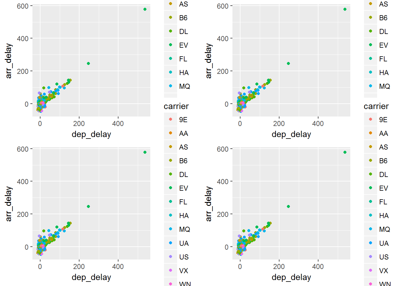 Note that you cannot tell the difference between these graphs. All of them display the same aesthetics and the same data, however the order in which you add things in differed. The end result is the same
Aesthetics in Layers
We can add override or remove aesthetic mappings depending on what we are doing.
| Operation | Layer Aesthetics | Result |
|---|---|---|
| Add | aes(color = carrier) |
aes(data, arr_delay, color=carrier) |
| Override | aes(y = dep_delay) |
aes(data, dep_delay) |
| Remove | aes(y=NULL) |
aes(data) |
Below we will see some examples of this.
library(gridExtra)
p1 = ggplot(data, aes(dep_delay, arr_delay, colour = carrier)) +
    geom_point() +
    geom_smooth(method = "lm", se = FALSE) +
    theme(legend.position = "none")

p2 = ggplot(data, aes(dep_delay, arr_delay)) +
    geom_point(aes(colour = carrier)) +
    geom_smooth(method = "lm", se = FALSE) +
    theme(legend.position = "none")

grid.arrange(p1,p2, ncol=2)
In the graph on left we will see that we have added the color to the carrier in the initial calling of the function. This leads to having a smoothing for each of the carriers. In the graph on the right we only color the points by carrier and therefore the smooth is over the entire data which was not specified to be split into groups.
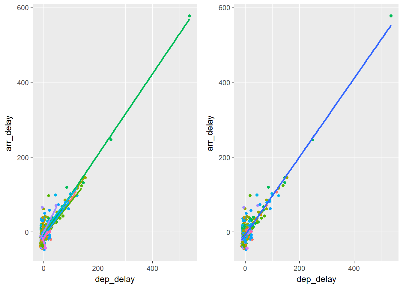
What happens here is that if you add the aes() in the initial calling of ggplot then the feature carries through all the layers. If you add aes() in a layer then the aesthetics are for that particular layer.
Settings vs Mappings
We can map an aesthetic to a certain variables or we can set it to be a constant.
library(gridExtra)
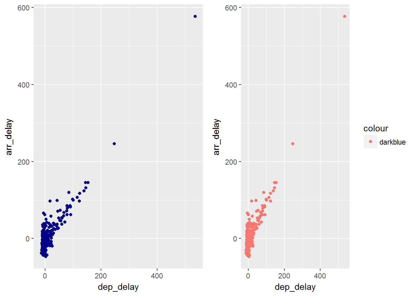
p1 = ggplot(data, aes(dep_delay, arr_delay)) +
geom_point(color = "darkblue")
p2 = ggplot(data, aes(dep_delay, arr_delay)) +
geom_point(aes(color="darkblue"))
grid.arrange(p1,p2, ncol=2)In the first plot we can see setting an aesthetic of the color dark blue. In the second plot we create a new variable called darkblue, since this only has one value it returns a pinkish color in scale.
We could also map the value and then override the default scale
ggplot(data, aes(dep_delay, arr_delay))+
      geom_point(aes(color="darkblue")) +
      scale_color_identity()
Other Aesthetic Mappings
Sometimes we map aesthetics to constant values. This allows us to distinguish between layers.
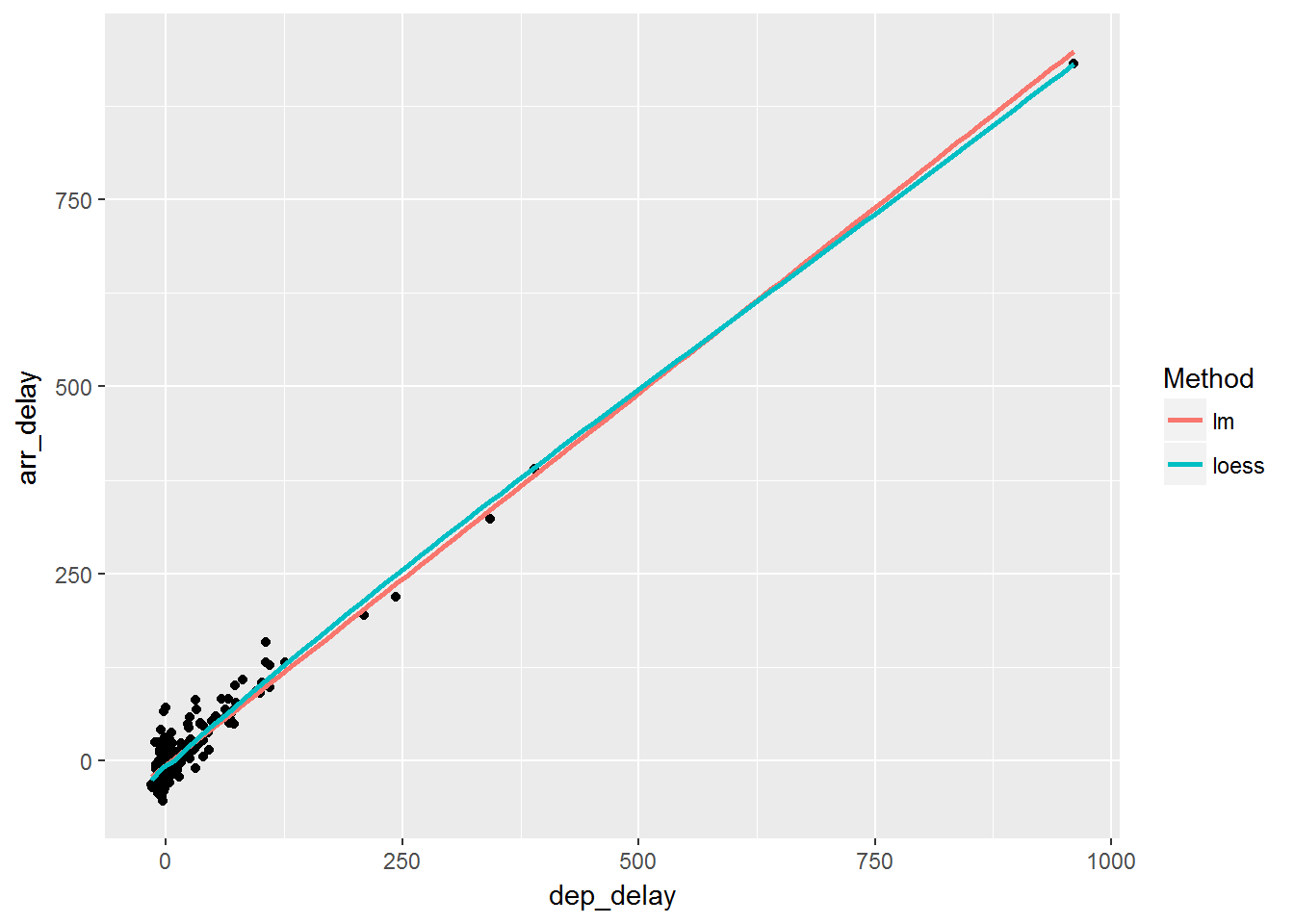
ggplot(data, aes(dep_delay, arr_delay)) +
    geom_point() +
    geom_smooth(aes(color="lm"), method="lm", se=F) +
    geom_smooth(aes(color="loess"), method="loess", se=F) +
  labs(color = "Method")
We can see here that we now have added 2 smooth layers and we asked that it be colored by that particular smooth.
Statistical Transforms
Many times we wish to do more than what we have seen at this point. We wish to add different statistical features to the graph. stat transforms the data. This is typically just a summary of some sort. Useful ones are smoothing or identity. You typically do not call them directly but the geom does.
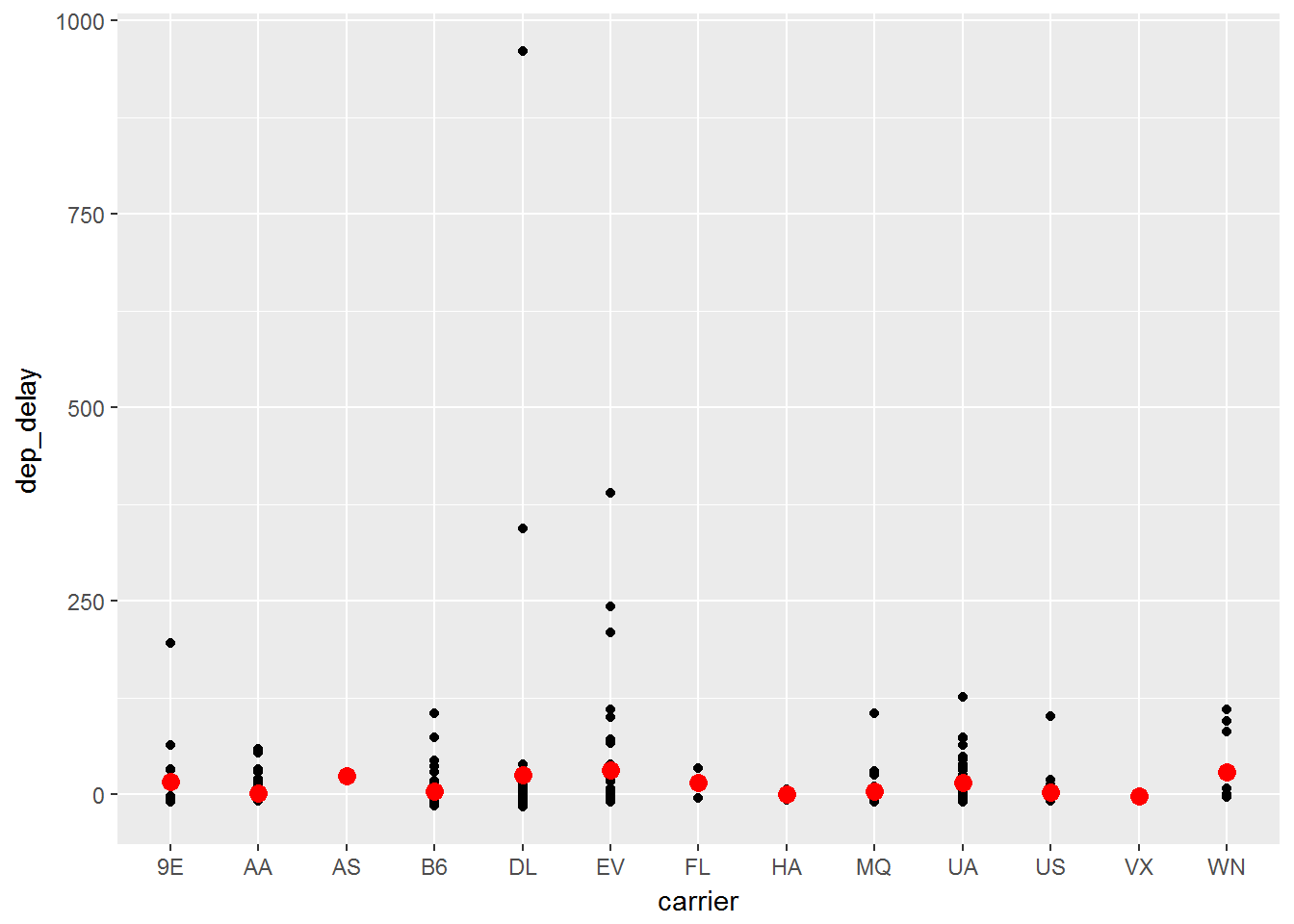
ggplot(data, aes(carrier, dep_delay)) +
    geom_point() +
    stat_summary(geom = "point", fun.y = "mean", color = "red", size = 3)

ggplot(data, aes(carrier, dep_delay)) +
    geom_point()+
    geom_point(stat = "summary", fun.y = "mean", color = "red", size = 3)
You can see that we have called one layer with a stat_summary() function and asked for the mean. Both of these produce the graph below.
Position Adjustments
We can use position adjustments to tweak the position of elements.
For example with bars:
position_stack() stack overlapping bars
position_fill() stack overlapping bars and scale to 1
position_dodge() place overlapping bars next to each other.
dplot <- ggplot(diamonds, aes(color, fill = cut)) +
    xlab(NULL) + ylab(NULL) + theme(legend.position = "none")
    # position stack is the default for bars, so geom_bar()
    # is equivalent to geom_bar(position = "stack").
    p1 = dplot + geom_bar()
    p2 = dplot + geom_bar(position = "fill")
    p3 = dplot + geom_bar(position = "dodge")
grid.arrange(p1,p2,p3, ncol=3)
In the three graphs we will see the differences between the different position functions:
## Error in eval(expr, envir, enclos): could not find function "grid.arrange"