Back to: Introduction to R
It is very important when making graphs to be able to label features. We will look at various ways in which we can label our graphics now.
Labeling the Axes
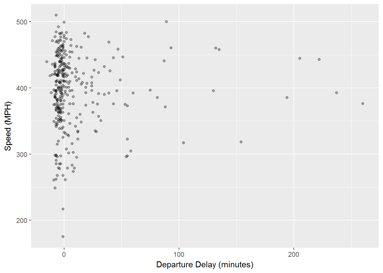
We can add a lot of features to the axes but for now we will just change labels. We use xlab and ylab for this, if we set them to NULL we have blank axes labels. For example we can make a graph based on departure delay and speed:
ggplot(data, aes(dep_delay, distance/air_time*60)) +
    geom_point(alpha = 1 / 3) +
    xlab("Departure Delay (minutes)") +
    ylab("Speed (MPH)")
We can see that the xlab() and the ylab() functions are just added in as layers. They produce the graph below.
Other Text Labels
Aside from labeling the axes, many times we want to add other text into our graphics. geom_text will allow a user to add text to a graph. We simply add geom_text() as a layer and this layer has the following options:
the option family allows a user to specify font.
the option fontface allows a user to specify: plain, bold or italic.
hjust, vjust allows a user to specify location of the text.
size allows the user to adjust the size of a graph.
Font Families
We will first look at the different font styles that could be used with geom_text() using the family option. These 3 fonts work with every type of graph in ggplot:
df <- data.frame(x = 1, y = 3:1, family = c("sans", "serif", "mono"))
ggplot(df, aes(x, y)) +
geom_text(aes(label = family, family = family))
As you can see below we now have three different labels with three different font types.

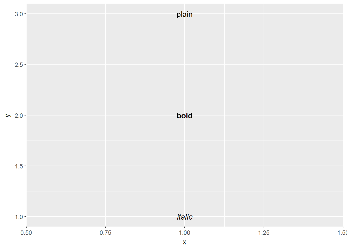
Font Face Styles
Many times we also wish to add other attributes to our text. The font face allows for plain text, bold text, and italic text.
df <- data.frame(x = 1, y = 3:1, face = c("plain", "bold", "italic"))
ggplot(df, aes(x, y)) +
geom_text(aes(label = face, fontface = face))
Once again, geom_text() is a layer and this time we use the text labels of:
plain
bold
italic
Then we specify that each of these has the same face as their name.
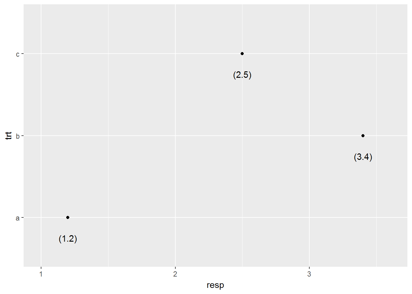
Nudge to label existing points
The nudge allows us to move the text horizontally or vertically to label points. If we did not do this, our text would lie directly on top of the point. We use nudge_x and nudge_y in order to move the text in the x and ydirection respectively.
df <- data.frame(trt = c("a", "b", "c"), resp = c(1.2, 3.4, 2.5))
ggplot(df, aes(resp, trt)) +
    geom_point() +
    geom_text(aes(label = paste0("(", resp, ")")), nudge_y = -0.25) +
    xlim(1, 3.6)
The code above uses the paste command which takes information and combines it together. In this example the paste will take the values of resp and place them inside parenthesis. Then we use nudge_y-0.25 to move the label below the point and the addition of xlim(1,3.6) is a layer that tells us what the x-axis should extend to and from:
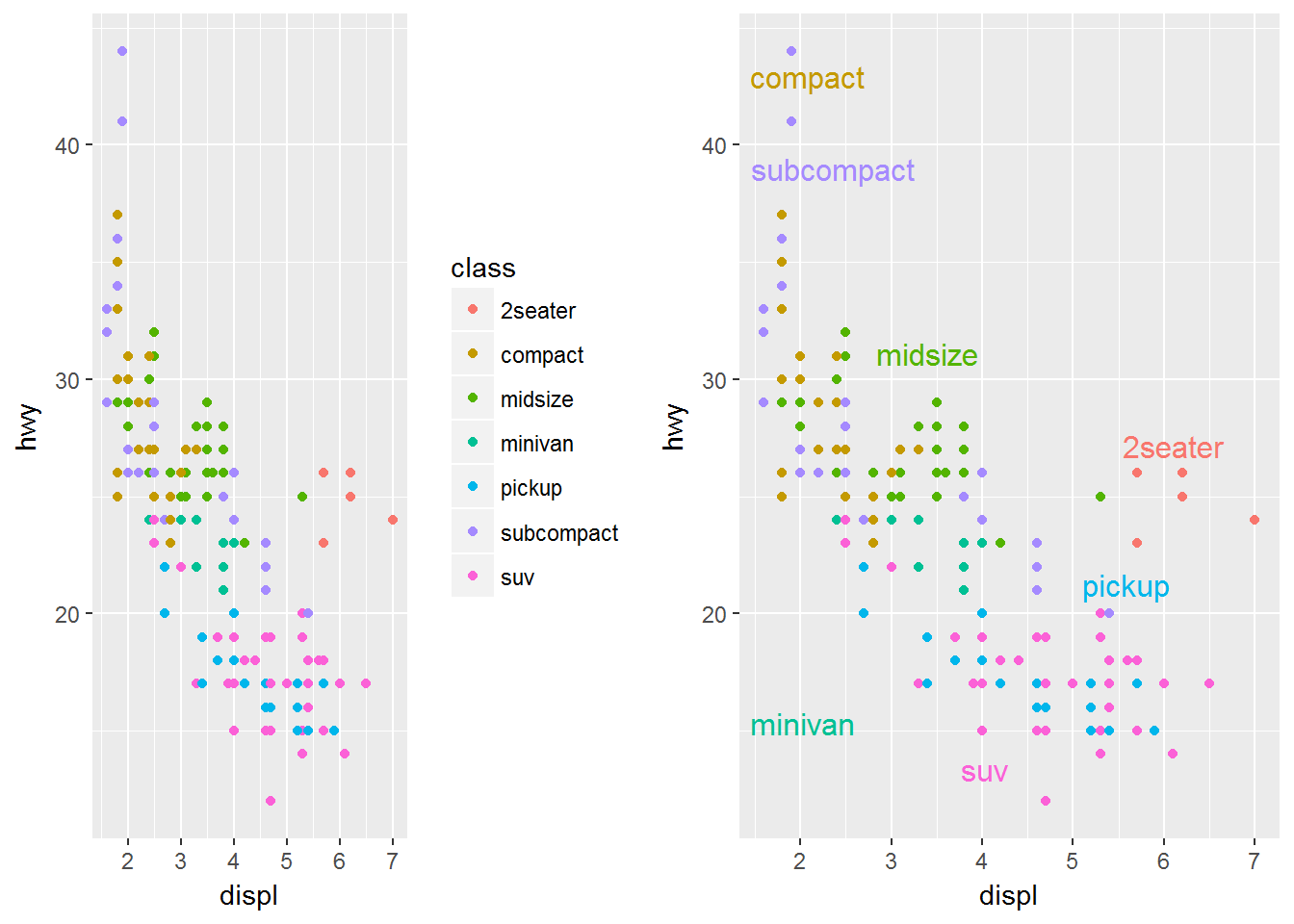
Labels Rather than a Legend
One other common feature of a graph can be to use labeling rather than a legend. The code is a bit more advanced for this phase, below you can see that we have done a few different things.
1. We created 2 plots p1 and p2.
2.p2 uses geom_dl() to add labels as a legend
3. grid.arrange() allows us to place the graphs side by side.
library(directlabels)
library(gridExtra)
p1 = ggplot(mpg, aes(displ, hwy, colour = class)) +
    geom_point()
p2 = ggplot(mpg, aes(displ, hwy, colour = class)) +
    geom_point(show.legend = FALSE) +
    geom_dl(aes(label = class), method = "smart.grid")
grid.arrange(p1,p2, ncol=2)
What you will see happen is the graph on the left, p1, will have the traditional legend that is displayed when you color by a categorical variable. Then the graph on the right p2 will place those same labels throughout the plot with the particular color that that label is.