Back to: Introduction to R
Facetting is an excellent way to look at categorical data. This is where we split up the graphs and create a graph for each category. We will learn about two basic functions:
facet_wrap
facet_grid
facet_wrap
We first will consider a facet_wrap:
data = flights %>% sample_frac(.01)

ggplot(data, aes(x=distance, y= dep_delay)) +
      geom_point() +
      facet_wrap(~carrier)
Notice that we are still working with the distance versus delay. We start out with our original scatter plot. Then we add yet another layer. This layer is the facet_wrap() where we wrap it based on carrier. Below you can see the results for this.
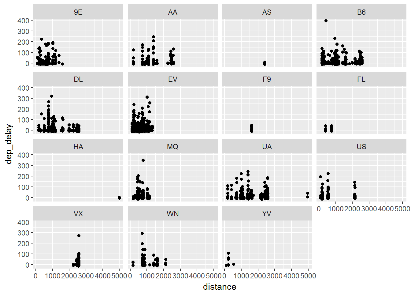
Given the hard to read x-axis, it may be worthwhile to scale the distance differently to better see what happens.
facet_grid
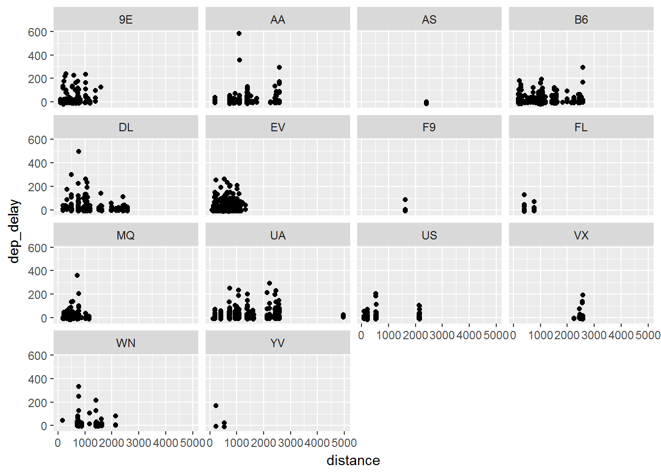
We then will note a similar effect when we use facet_grid():
data = flights %>% sample_frac(.01)

ggplot(data, aes(x=distance, y= dep_delay)) +
      geom_point() +
      facet_grid(~carrier)
This is where the language of graphs really helps. We first take the data and group it based on distance and departure delay. We state to place these as points on a graph. Finally we use the facet_grid() to take that plot and split it by the carrier. Each time you add a layer you can accomplish a little more towards your goal.
What about Other plots?
So far we have been focusing on scatter plots. As we continue to move through this section we will note that there are many other geom functions that can be used:
geom_smooth fits a smoothing line in data
geom_boxplot box and whisker plot of data
geom_histogram and geom_freqpoly distribution graphs
geom_bar distribution of categorical data
geom_path and geom_line lines between data points