Back to: Introduction to R
We have focused on the data up until this point and now we will look at the aesthetic attributes. These consist of:
color
size
shape
Color
To start we will focus on the color. We will look at
1. Color by groups.
2. Color of points.
Color by Groups
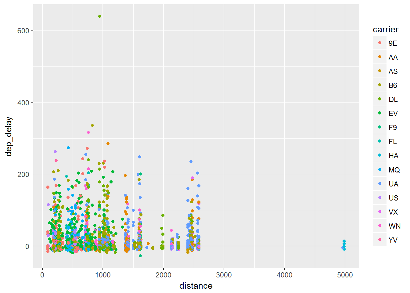
An important way to distinguish data can be to change the color of the groups. `ggplot2“ has many default scales that convert your groups to color levels. These can be over ridden but we will stick to the basics for now. We consider the same plot that we used before and now we will add color by the carrier brand:
library(dplyr)
library(ggplot2)
library(nycflights13)
data = flights %>% sample_frac(.01)

ggplot(data, aes(x=distance, y= dep_delay, color=carrier)) +
      geom_point()
The code shows that in the aesthetic portion (aes()) and we have added that carrier is associated with color. The plot is shown below.
Color of points
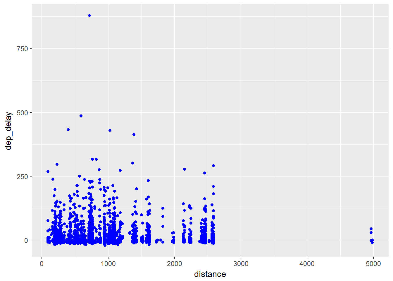
Not only can we add color to the aesthetic portion but we can add it into the particular layers.
library(dplyr)
library(ggplot2)
library(nycflights13)
data = flights %>% sample_frac(.01)

ggplot(data, aes(x=distance, y= dep_delay)) +
      geom_point(color=blue)
This will change the color of all the points as you can see below.
Size
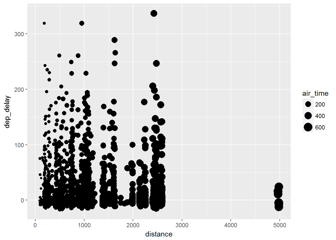
Now that we can color the points and color by groups we can also add the attributes of different sizes.
library(dplyr)
library(ggplot2)
library(nycflights13)
data = flights %>% sample_frac(.005)

ggplot(data, aes(x=distance, y= dep_delay, size=air_time)) +
      geom_point()
Note that whenever you see an attribute inside the aes() function it applies that attribute to a particular variable. In this case, the size of the points will be increased depending on the air time of the flight.
Shape
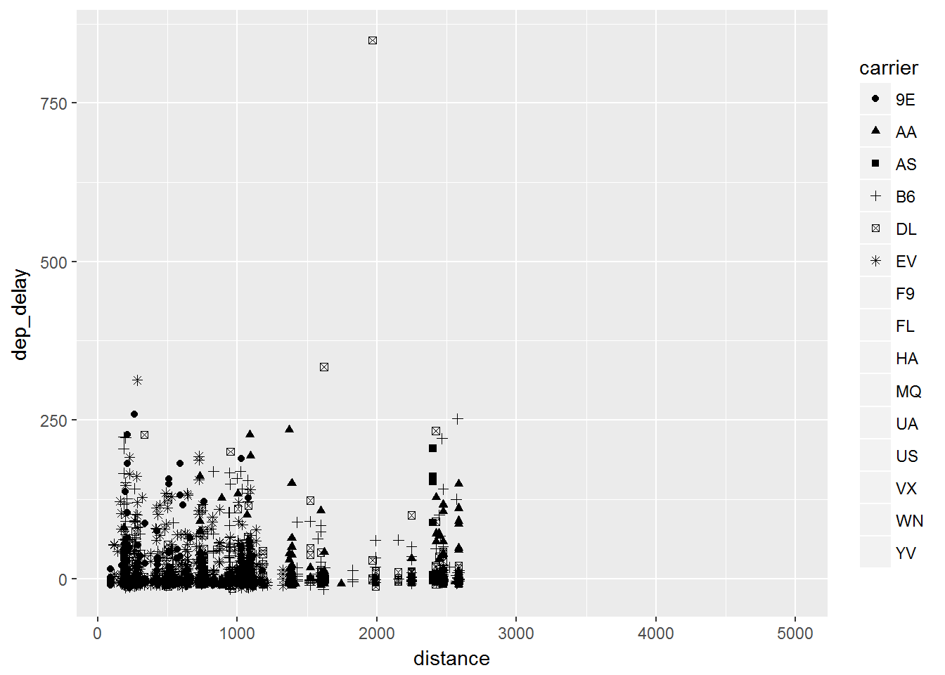
One other important attribute to distinguish between groups can be to have a unique shape for each group. This time we add shape=carrier into the aes() function and have a unique shape for each specific carrier.
library(dplyr)
library(ggplot2)
library(nycflights13)
data = flights %>% sample_frac(.01)

ggplot(data, aes(x=distance, y= dep_delay, shape = carrier)) +
      geom_point()
This produces the graph that you see below.
Conclusion
In each case we can group by size, shape or color.
We can also specify size, shape or color of a particular layer.