Back to: Introduction to R
ggplot2
We will begin our journey into statistical graphics with the package ggplot2. This is another package by Hadley Wickham and is part of the tidyverse. This means we can use piping or chaining to build our graphics. After going through this material, if you would like further information please check out the following books:
The R Graphics Cookbook by Winston Chang provides a set of recipes to solve common graphics problems. Read this book if you want to start making standard graphics with ggplot2 as quickly as possible.
ggplot2: Elegant Graphics for Data Analysis by Hadley Wickham describes the theoretical underpinnings of ggplot2 and shows you how all the pieces fit together. This book helps you understand the theory that underpins ggplot2, and will help you create new types of graphic specifically tailored to your needs.
What can’t ggplot2 do?
A good place to start might be with what ggplot2 cannot do. From here we will introduce what it can do.
3d graphs.
Interactive graphs, use ggvis
DAGs, see igraph
New York City Flights 13
For this section of the course we will consider the New York City Flights 2013 data. This data contains information on all arriving and departing flights from NYC in 2013. The variables in this dataset are:
year, month, day Date of departure
dep_time,arr_time Actual departure and arrival times.
sched_dep_time, sched_arr_time Scheduled departure and arrival times.
dep_delay, arr_delay delays in minutes
hour, minute Time of scheduled departure
carrier carrier abbreviation
tailnum Tail number of plane.
flight flight number.
origin, dest Origin and Destination
air_time Time spent in air.
distance Distance flown.
time_hour scheduled date and hour of flight.
ggplot2ggplot2 components
As we start with ggplot2 it is important to understand the structure of this. The bas graphics built into R require the use of many different functions and each of them seem to have their own method for how to use them. ggplot2 will be more fluid and the more you learn about it the more amazing of graphics you can create. We will get started with the components of every ggplot2 object:
1. data
2. aesthetic mappings between variables in the data and visual properties.
3. At least one layer which describes how to render the data. – Many of these are with the geom()function.
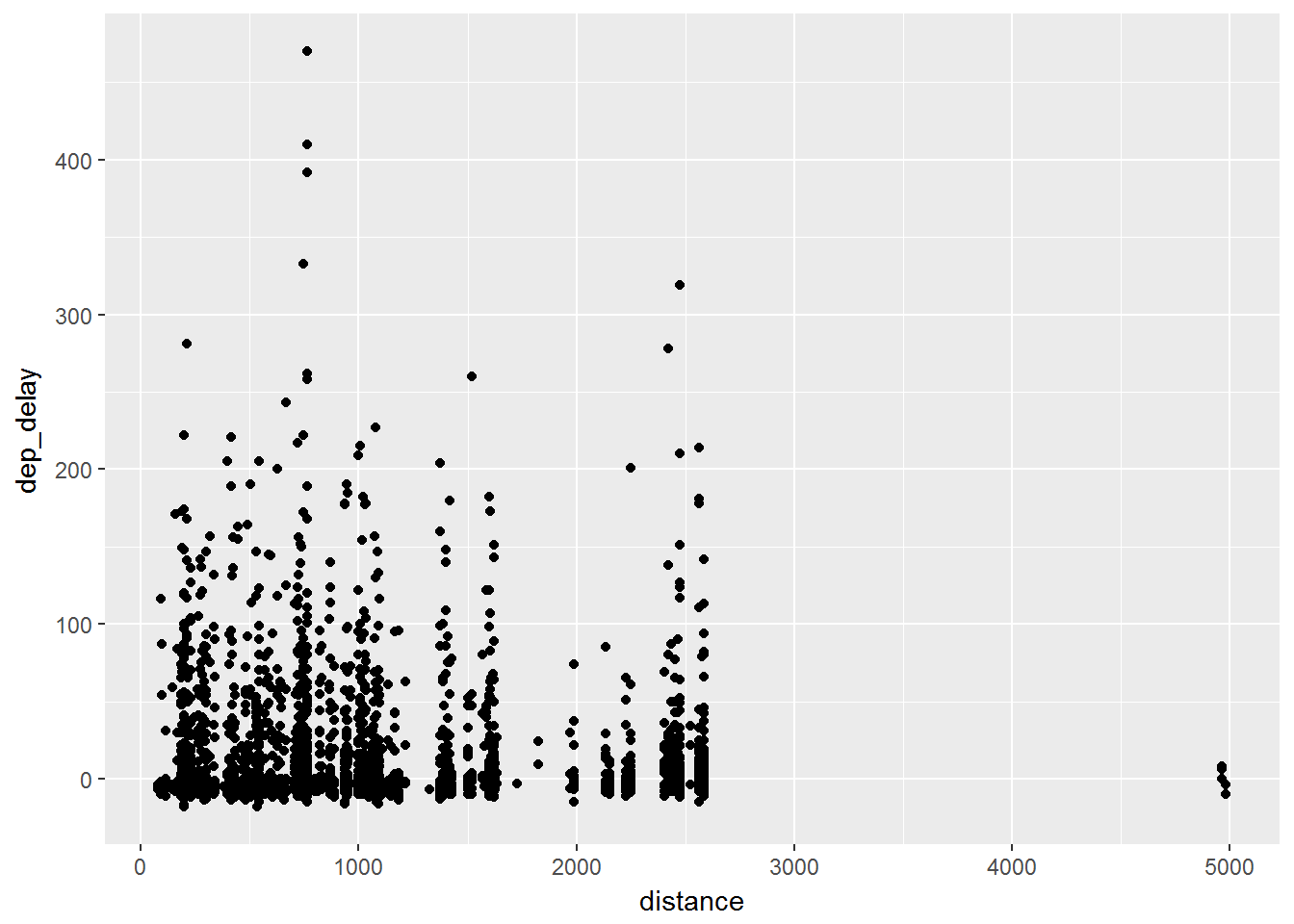
For example, we will create a simple scatter plot of distance by departure delay:
library(dplyr)
library(ggplot2)
library(nycflights13)
data = flights %>% sample_frac(.01)

ggplot(data, aes(x=distance, y= dep_delay)) +
      geom_point()
What the code first does is takes a random 1% sample of all of the flights data. Given that the original data has 336,776 flights, it can be hard to vizualise this much data with any clarity so we will observe a sample for this. We then see that the aesthetic mapping is distance by departure delay. Finally we have a layer of points. This then leads to the following graph:
As we proceed through this section we will begin the graph things in the following pattern:
1. data
2. aesthetic mappings
3. geometric objects
4. statistical transformations
5. scales
6. coordinate systems
7. position adjustments
8. faceting