Back to: Introduction to R
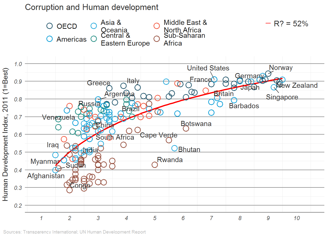
We will use an example created by the Institute for Quantitative Social Science at Harvard University. The goal will be to create a copy of a very nice graph from the economist:

Make sure you can Run this Code
require(ggplot2)
require(ggrepel)
dat <- read.csv("https://drive.google.com/uc?export=download&id=0B8CsRLdwqzbzUDJLa1owSVduLTA")
We will begin by using the ggplot2 package to create this graph.
We will start with a basic plot of CPI (Corruption Index) vs HDI (Human Development Index):
# Calls data then the asthetics are x,y and how coloring works
pc1 <- ggplot(dat, aes(x=CPI, y=HDI, color=Region))
#geom_point() is how we choose points to be plotted
pc1 + geom_point()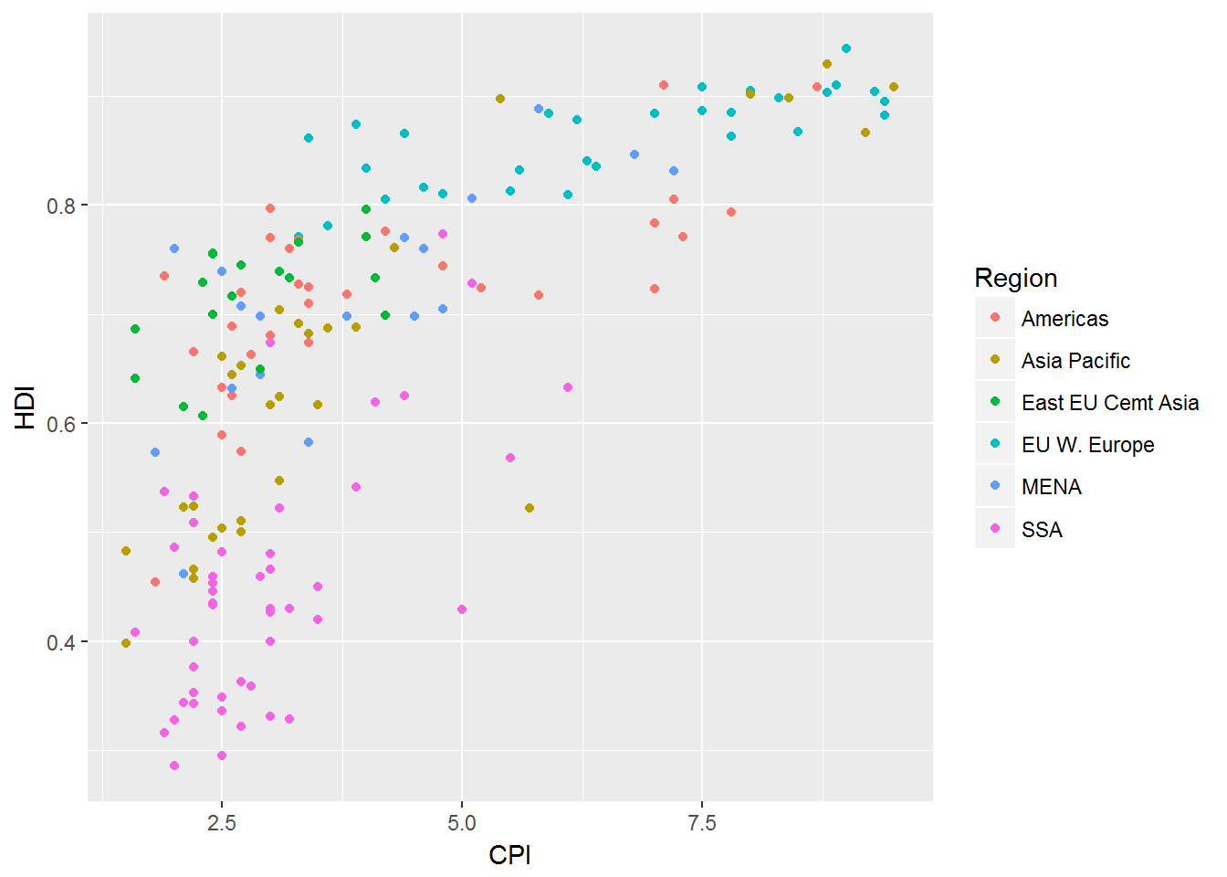
This is a long way off from our desired graph. We still need:
add a trend line
change the point shape to open circle
label select points
change the order and labels of Region
title, label axes, remove legend title
fix up the tick marks and labels
move color legend to the top
theme the graph with no vertical guides
add model R2 (hard)
add sources note (hard)
final touches to make it perfect (use image editor for this)
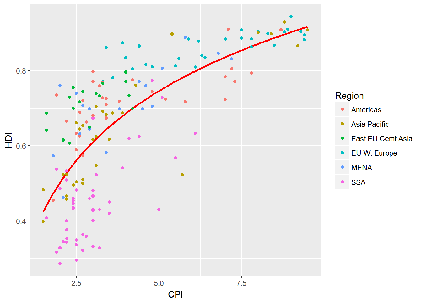
Trend Lines
This is easy to do if you know the trend line in which you wish to fit.
This time we go with a function HDI=log(CDI)HDI=log(CDI).
(pc2 <- pc1 +
   geom_smooth(aes(group = 1),
               method = "lm",
               formula = y ~ log(x),
               se = FALSE,
               color = "red")) +
   geom_point()
In this the geom_smooth adds the line to the graph, then on top of that geom_point() adds the points.
Change Point Shape
We begin this by exploring the point options in R, ?shape.
The following is an example that the shape page gives us:
## A look at all 25 symbols
df2 <- data.frame(x = 1:5 , y = 1:25, z = 1:25)
s <- ggplot(df2, aes(x = x, y = y)) +
  geom_point(aes(shape = z), size = 4) + scale_shape_identity() +
  geom_point(aes(shape = z), size = 4, colour = "Red") +
  scale_shape_identity() +
  geom_point(aes(shape = z), size = 4, colour = "Red", fill = "Black") +
  scale_shape_identity()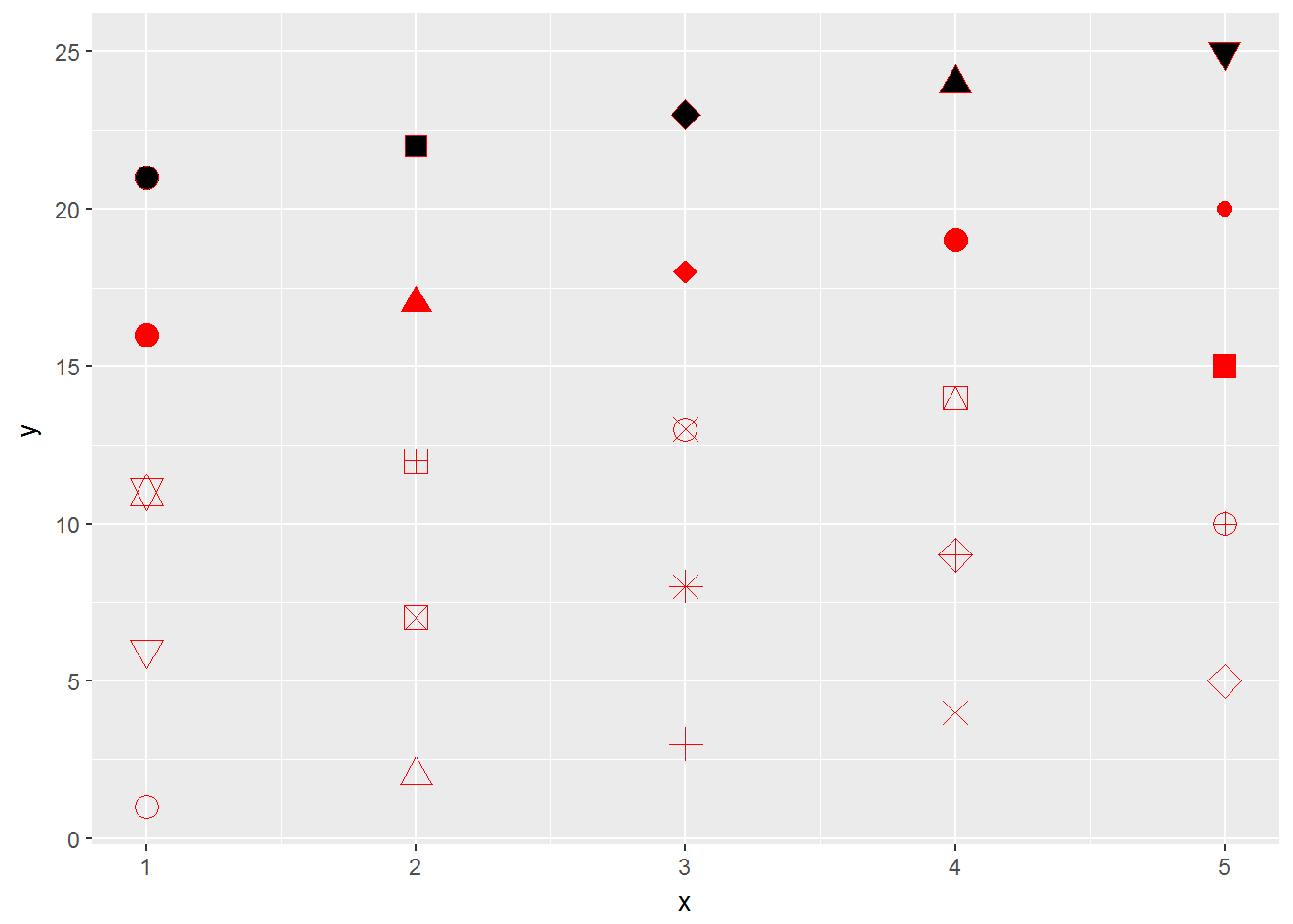
We then desire to have shape 1 for our graph:
pc2 + geom_point(shape=1, size=4)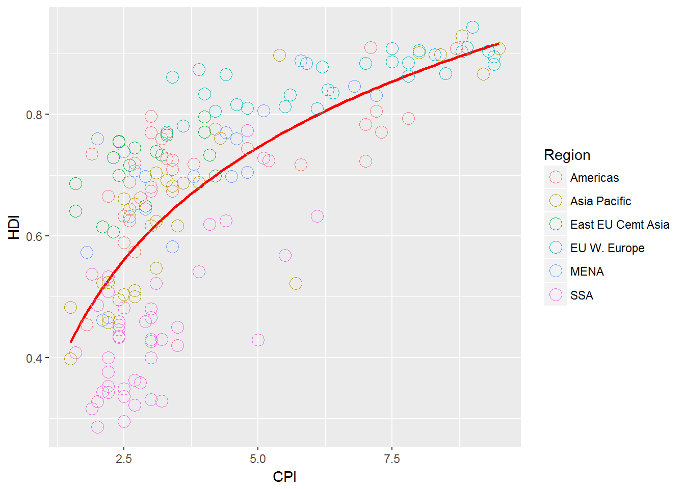
This looks good but the original has thicker circles so we can play with this a little more to get
(pc3 <- pc2 +
   geom_point(size = 4.2, shape = 1) +
   geom_point(size = 4.3, shape = 1) +
    geom_point(size = 4.1, shape = 1) +
   geom_point(size = 4, shape = 1) +
   geom_point(size = 3.9, shape = 1) +
   geom_point(size = 3.8, shape = 1)+
   geom_point(size = 3.5, shape = 1))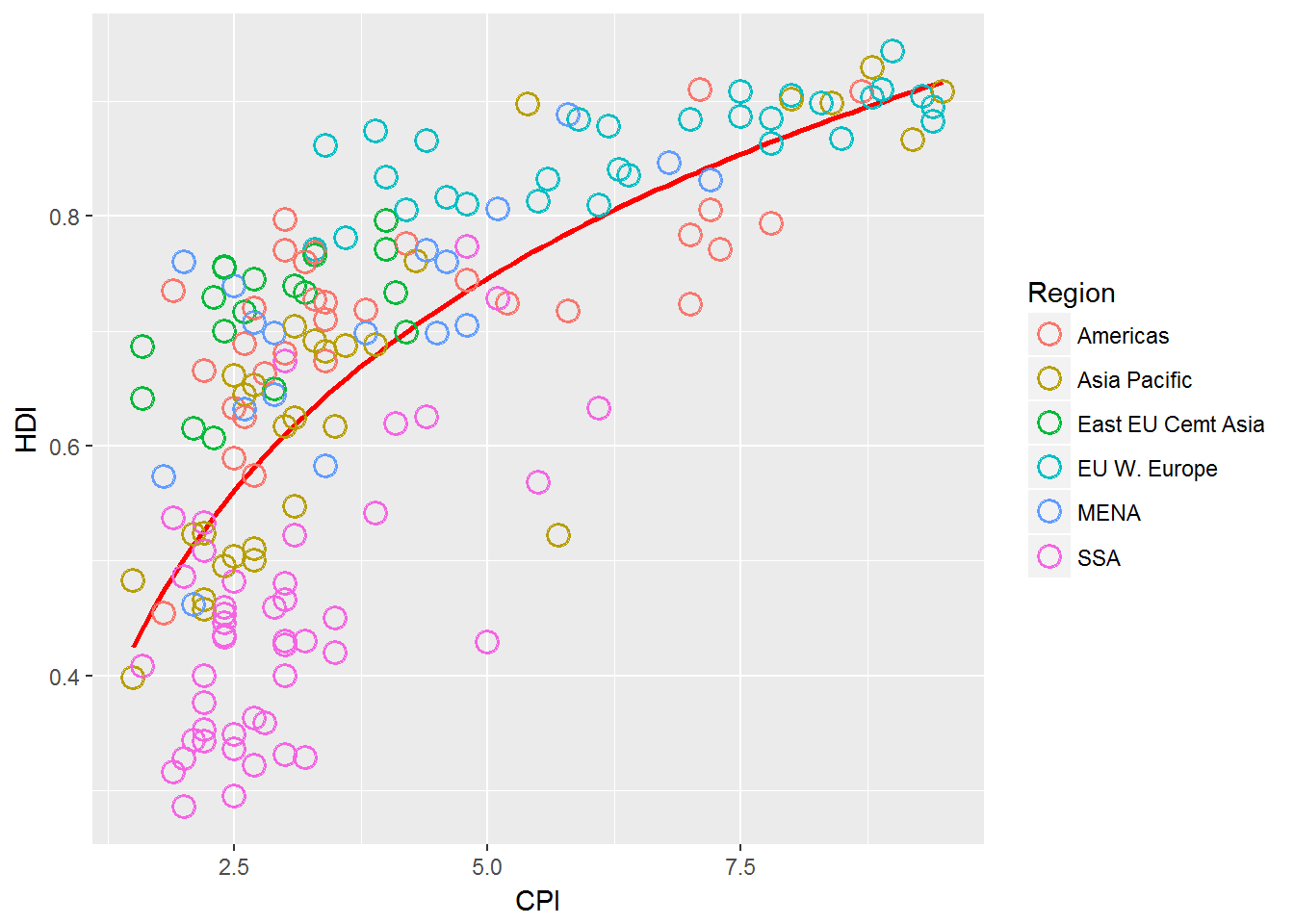
Label Select Points
With these labels there is no specific mathematical way to see why they were labeled. -This means we have to find a way to specifically label the ones we care about.
We then can use geom_text() to add labels to values.
pointsToLabel <- c("Russia", "Venezuela", "Iraq", "Myanmar", "Sudan",
                   "Afghanistan", "Congo", "Greece", "Argentina", "Brazil",
                   "India", "Italy", "China", "South Africa", "Spane",
                   "Botswana", "Cape Verde", "Bhutan", "Rwanda", "France",
                   "United States", "Germany", "Britain", "Barbados", "Norway", "Japan",
                   "New Zealand", "Singapore")
Label Select Points
 pc3 +
  geom_text(aes(label = Country),
            color = "gray20",
            data = subset(dat, Country %in% pointsToLabel))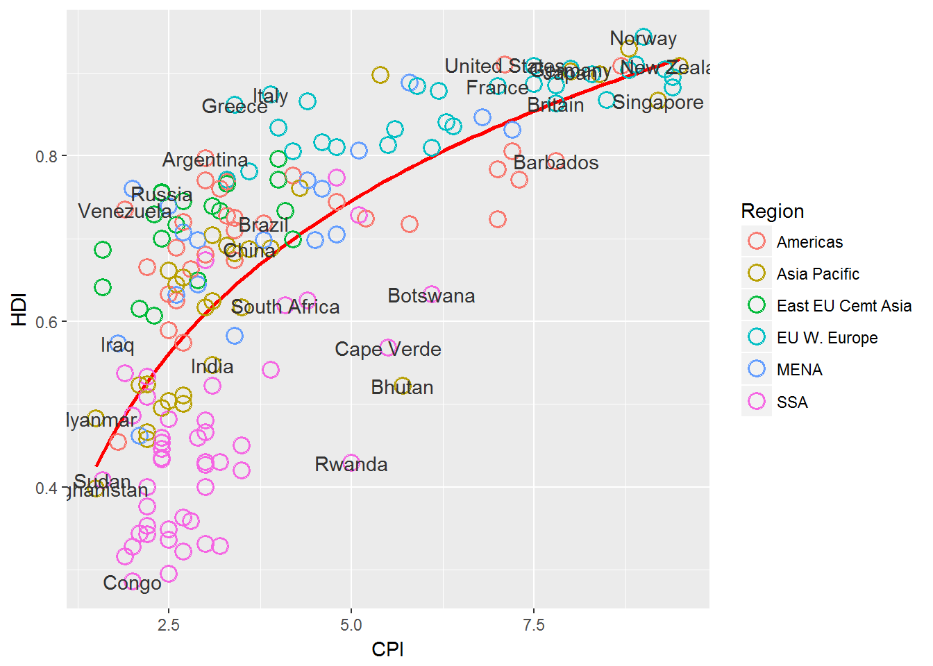
We notice that our text lays on top of the points here and it is hard to distinguish what point goes with which label.
We can solve this by using the ggrepel package:
library("ggrepel")
(pc4 <-pc3 +
  geom_text_repel(aes(label = Country),
            color = "gray20",
            data = subset(dat, Country %in% pointsToLabel),
            force = 10))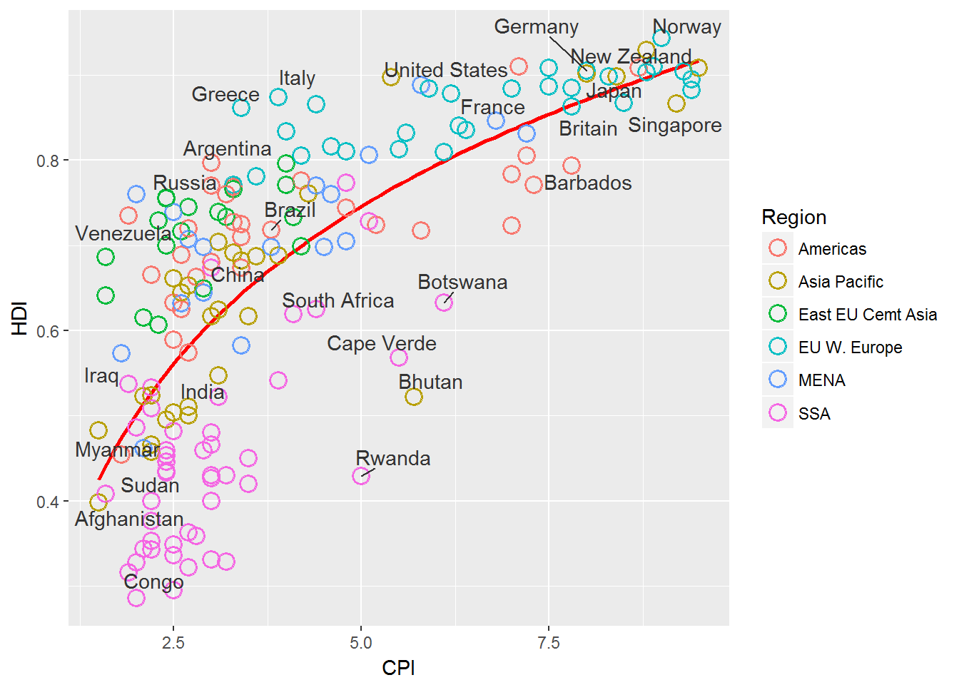
Change Region Labels and Order.
We can do this by adjusting the factor levels and labels.
dat$Region <- factor(dat$Region,
                     levels = c("EU W. Europe",
                                "Americas",
                                "Asia Pacific",
                                "East EU Cemt Asia",
                                "MENA",
                                "SSA"),
                     labels = c("OECD",
                                "Americas",
                                "Asia &\nOceania",
                                "Central &\nEastern Europe",
                                "Middle East &\nNorth Africa",
                                "Sub-Saharan\nAfrica"))
Change Region Labels and Order.
We then need to tell the graph that we have called pc4 above to use the new data that we have adjusted.
pc4$data <- dat
 pc4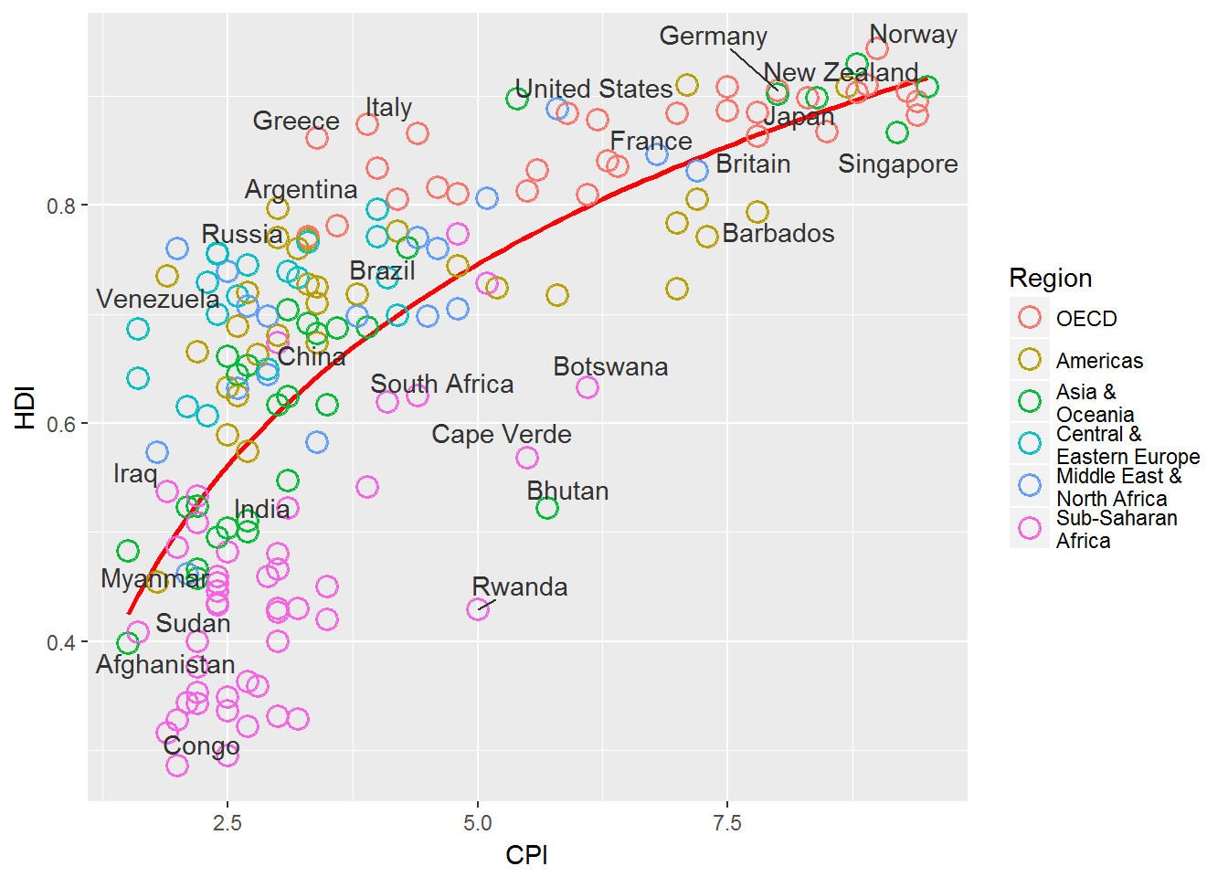
Add title and format axes.
We can adjust the axes by using scales in ggplot2.
We can add a title to a plot using ggtitle().
library(grid)
pc5 <- pc4 +
  scale_x_continuous(name = "Corruption Perceptions Index, 2011 (10=least corrupt)",
                     limits = c(.9, 10.5),
                     breaks = 1:10) +
  scale_y_continuous(name = "Human Development Index, 2011 (1=Best)",
                     limits = c(0.2, 1.0),
                     breaks = seq(0.2, 1.0, by = 0.1)) +
  scale_color_manual(name = "",
                     values = c("#24576D",
                                "#099DD7",
                                "#28AADC",
                                "#248E84",
                                "#F2583F",
                                "#96503F")) +
  ggtitle("Corruption and Human development")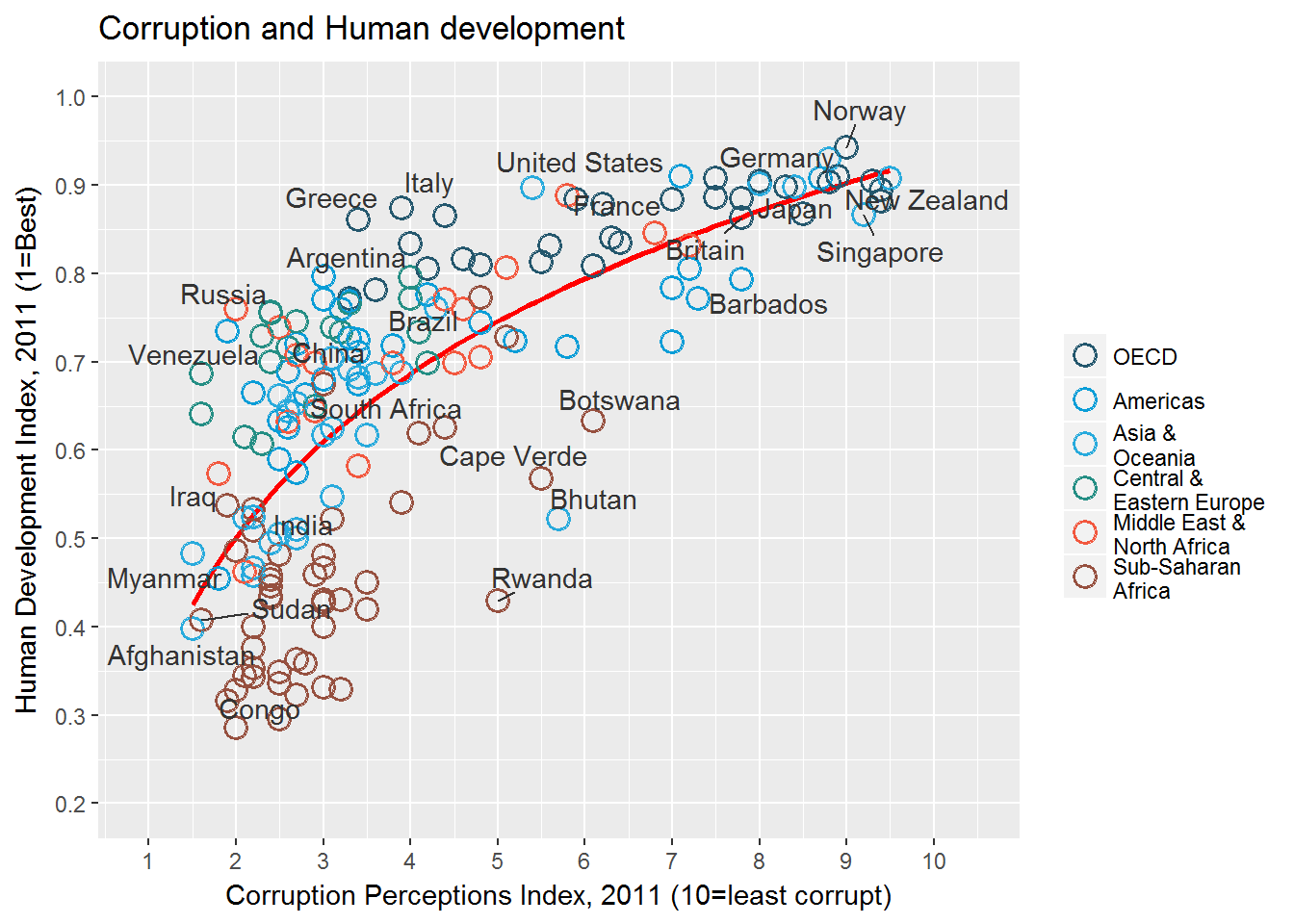
Final Changes to the output.
pc6 <- pc5 +
  theme_minimal() + # start with a minimal theme and add what we need
  theme(text = element_text(color = "gray20"),
        legend.position = c("top"), # position the legend in the upper left
        legend.direction = "horizontal",
        legend.justification = 0.1, # anchor point for legend.position.
        legend.text = element_text(size = 11, color = "gray10"),
        axis.text = element_text(face = "italic"),
        axis.title.x = element_text(vjust=-10), # move title away from axis
        axis.title.y = element_text(vjust = 2), # move away for axis
        axis.ticks.y = element_blank(), # element_blank() is how we remove elements
        axis.line = element_line(color = "gray40", size = 0.5),
        axis.line.y = element_blank(),
        panel.grid.major = element_line(color = "gray50", size = 0.5),
        panel.grid.major.x = element_blank()
        )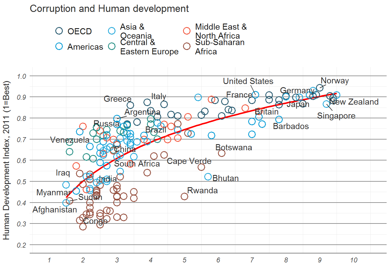
Add the R2 to the plot
mR2 <- summary(lm(HDI ~ log(CPI), data = dat))$r.squaredlibrary(grid)
#png(file = "images/econScatter10.png", width = 800, height = 600)
pc6
grid.text("Sources: Transparency International; UN Human Development Report",
x = .01, y = .01,
just = "left",
draw = TRUE, gp=gpar(fontsize=7, col="grey"))
grid.segments(x0 = 0.81, x1 = 0.825,
y0 = 0.90, y1 = 0.90,
gp = gpar(col = "red"),
draw = TRUE)
grid.text(paste0("R? = ",
as.integer(mR2*100),
"%"),
x = 0.835, y = 0.90,
gp = gpar(col = "gray20"),
draw = TRUE,
just = "left")
#dev.off()