Back to: Introduction to R
Many times we need to compare categorical and continuous data. We will consider the following geom_functions to do this:
geom_jitter adds random noise
geom_boxplot boxplots
geom_violin compact version of density
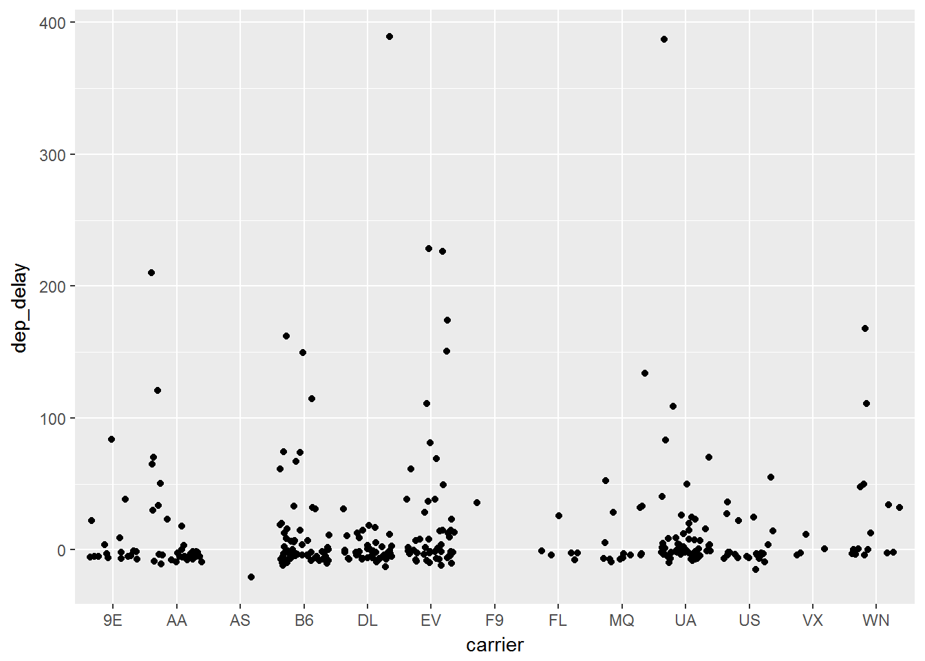
Jitter Plot
In when you group continuous data into different categories, it can be hard to see where all of the data lies since many points can lie right on top of each other. The jitter plot will and a small amount of random noise to the data and allow it to spread out and be more visible.
ggplot(data, aes(x=carrier, y= dep_delay)) +
        geom_jitter()
We can add this as another layer just like we did with geom_point() Below you can see the outcome of this code:
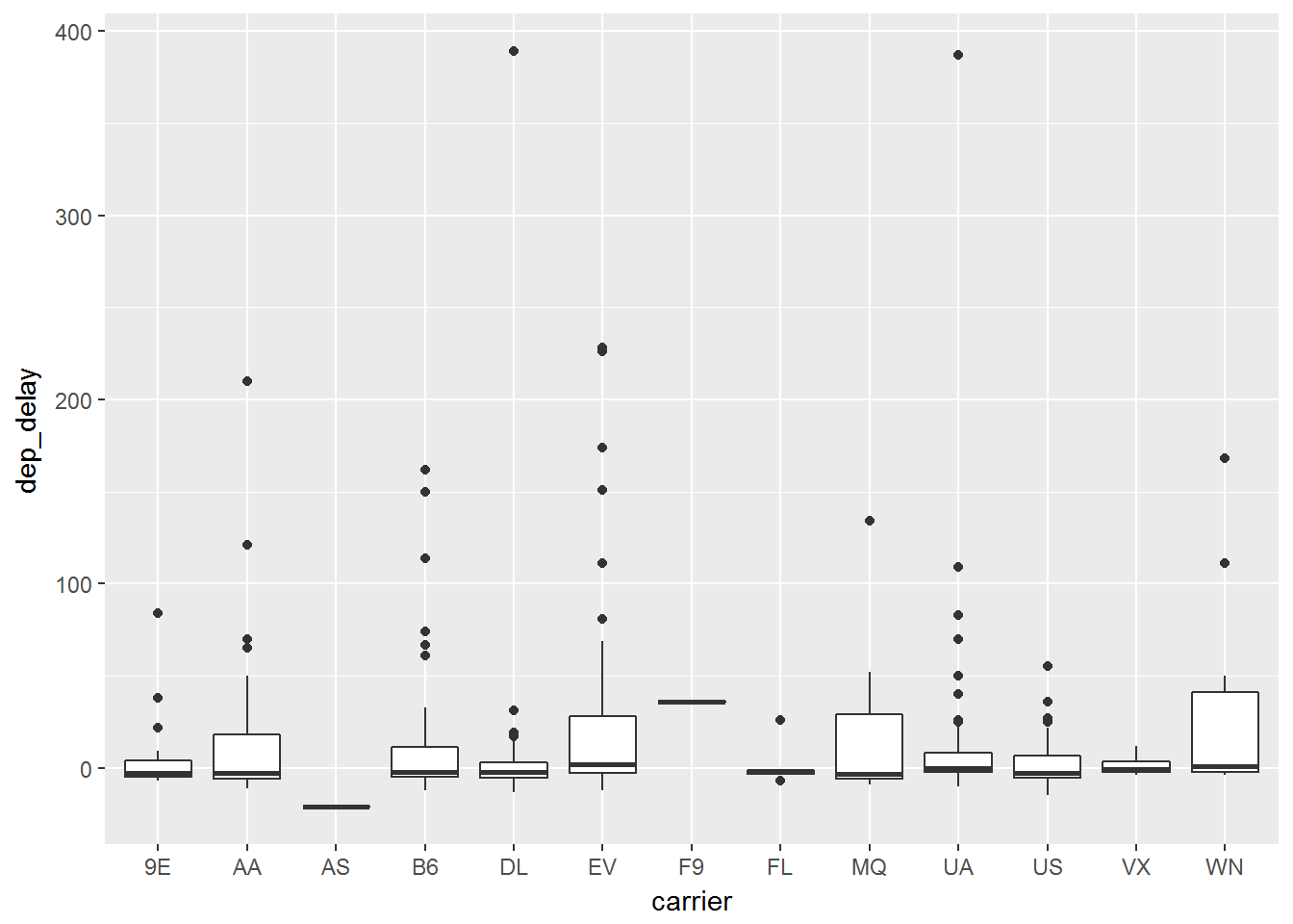
Boxplot
Boxplots are one of the most commonly used statistics plots to display continuous data. It is extremely useful to evaluate the distribution of a continuous random variable across multiple groups. We can easily make this by adding a geom_boxplot() layer:
ggplot(data, aes(x=carrier, y= dep_delay)) +
        geom_boxplot()
As you can see as long as we know the geom_ function that we wish to use, the rest comes by simply adding it as another layer. The above code leads to the graph below:
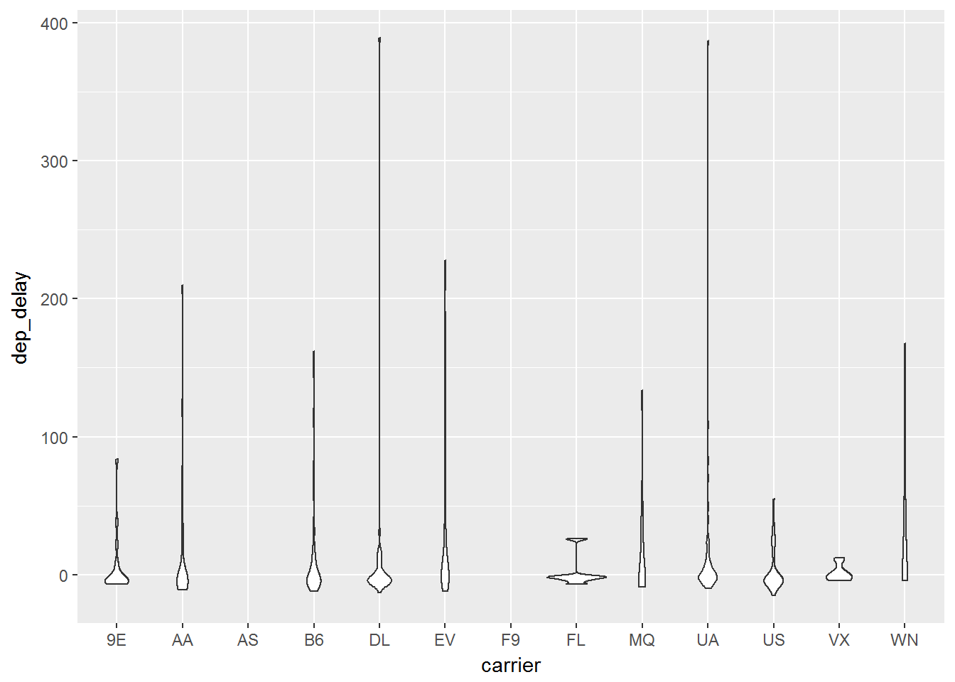
Violin
Another plot to help display continuous data among different categories. In order to deal with multiple data points lying in a close area, the violin plot is wider at points where the data is bulked. We can simply code this with a geom_violin() layer:
ggplot(data, aes(x=carrier, y= dep_delay)) +
        geom_violin()