Back to: Introduction to R
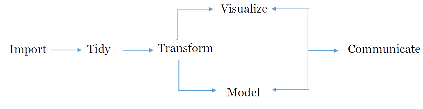
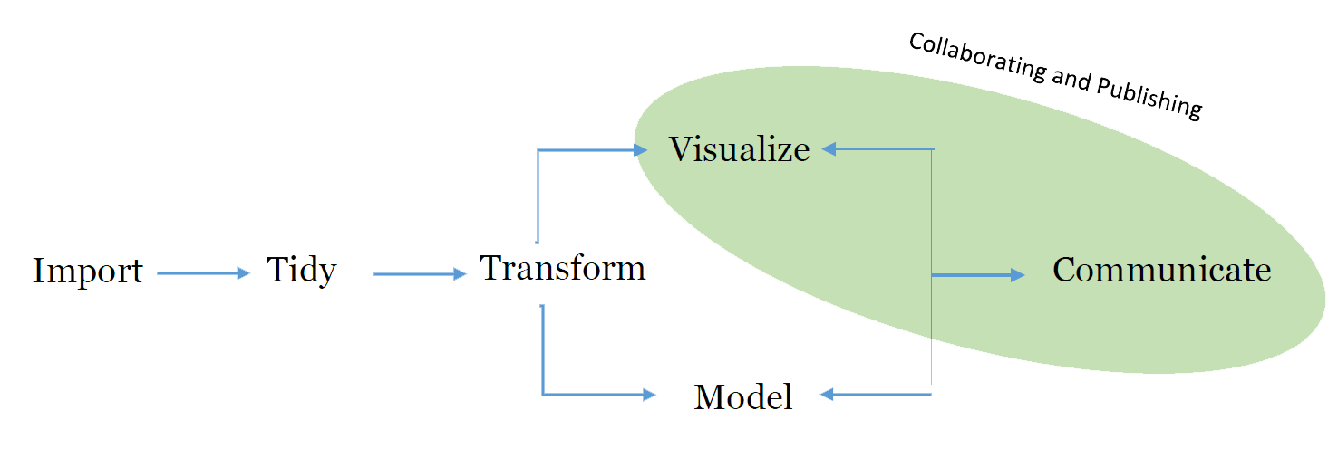
The diagram shows the natural flow of how we work with data and perform research. We will begin to explore what this means as we continue.
Data Wrangling
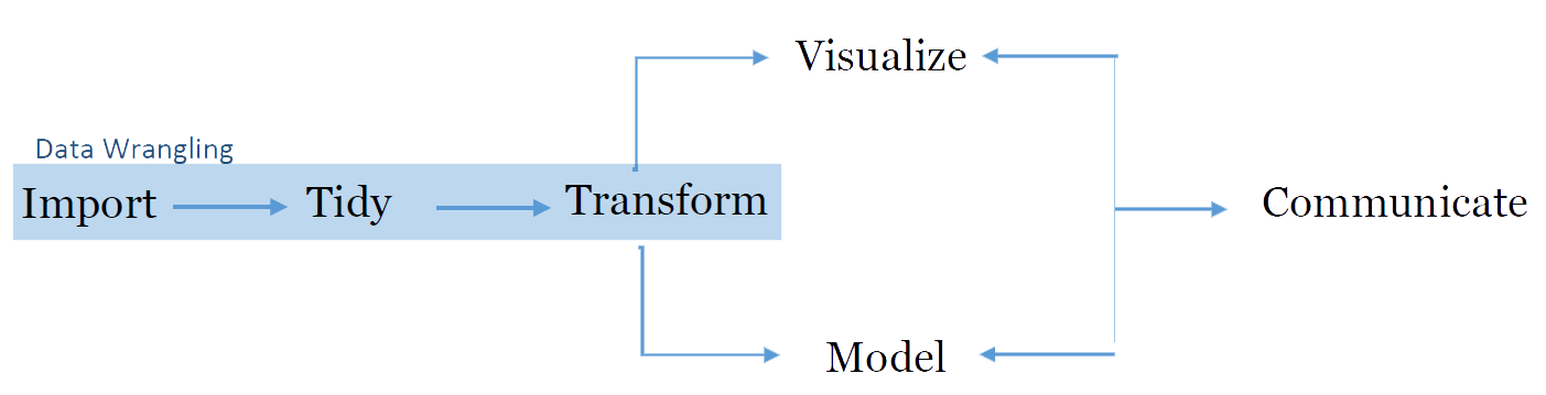
Once we have this data we find that very rarely is it ever in a useful form. In fact Dasau and Johnson suggest that this data preparation of cleaning may take up to 80% of the time.
This is where R has great power and by the end of this course you will be able to work with multiple data sources and wrangle data like a pro.
Importing Data
When it comes to importing your data R is very powerful. R can grab data from many courses including
.csv, .txt. .xls, ….
SPSS, SAS, Stata
Web Scraping
Databases
MySQL
Oracle
PostgreSQL
MongoDB
Tidying Data
Tidying Data is the process in making data useful. In this concept we have ecah column of data represent a variable and each row of data represents a single observation. This format is quite useful for data analysis. In this course we will rely heavily on the tidyr package.
Transforming Data
Once we have data into R and begin to tidy the data we usually need to transform multiple aspects of the data. R has many tools that allow a user to manipulate and transform data.
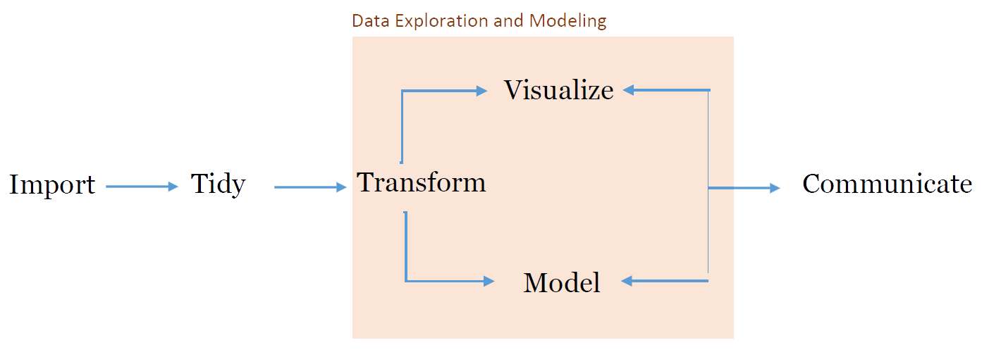
Data Exploration and Analysis
Visualizing Data
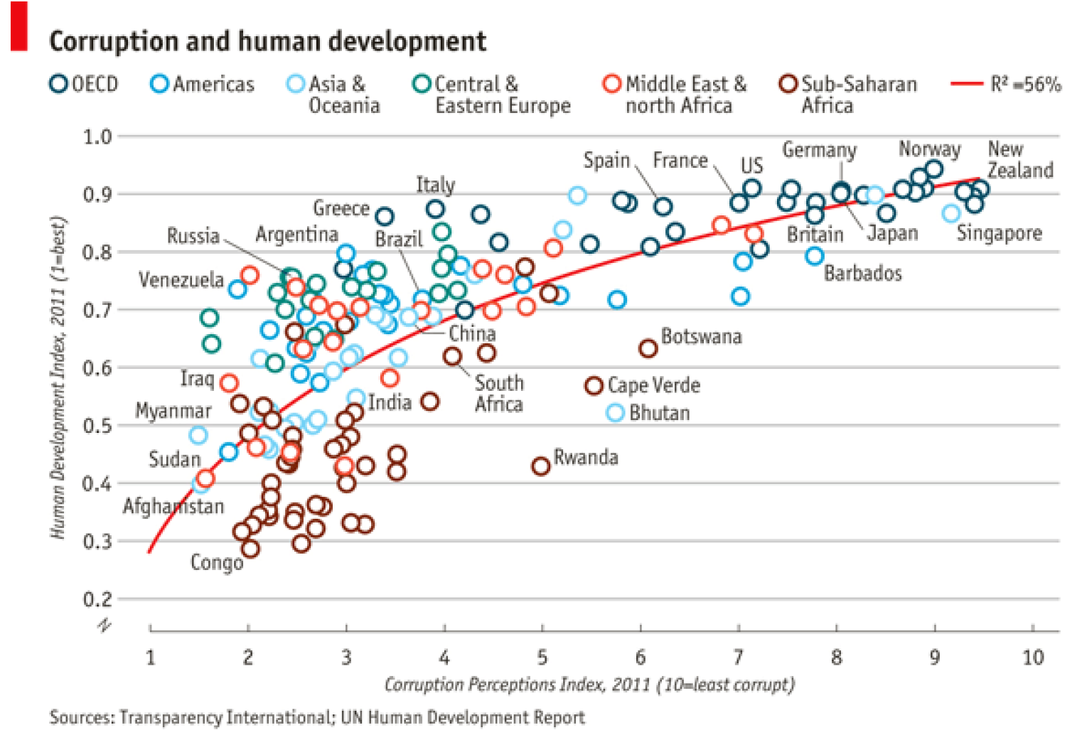
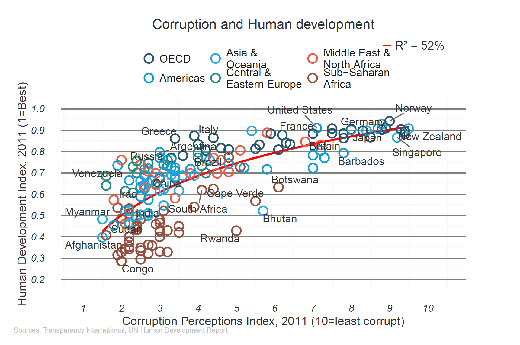
There are multiple ways to vizualize data in R. The base graphics are easy to use and outperform Stata, SAS and SPSS. In this course we will focus on using the ggplot2 package. This package is actually a language for grahpics and once a user becomes proficient you can create grahs like the one shown below which is created by Harvard Institute for Quantitative Social Science. The original plot came from the economist:
Once data has been vizualized it is important to model the data. R can handle anything from a simple t-test to the working with data that is overa terrabyte in size.
Data Collaboration and Publishing
RStudio connects easily to:
shiny provides an interactive data visualization and java script environment.
plotly allows for interactive graphics for webpages.
RStudio can make webpages, books, slides, and many other documents that can help relay data. (In fact this course was entirely built in RStudio using Github).