Back to: Assess for Risk of Bias
When you’re talking about your risk of bias decisions, you won’t have space to explain your assessment for every study and every study’s outcome. So, you’ll want to summarize your decisions. You can organize your summary by study, domain, or outcome, or a combination of these.
Summarize by domains
To quickly describe the risk of bias for each domain, you can describe the risk of bias domains for all of the studies together.
For example, you could write about missing participant data this way:
Of the 30 studies, 20 had a low risk of attrition bias for missing participant data, 8 had a high risk, and 2 were unclear.
You’ll visualize that information in a chart like the one below, which shows the proportion of studies that ranked low, high, or unclear for each risk of bias domain:
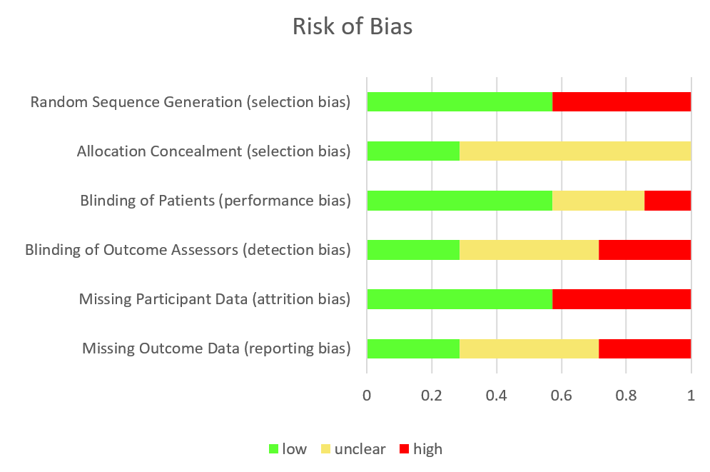
Notice that green is used for low risk of bias, yellow is for unclear, and red is for high risk of bias.